In what ways does your media product use, develop or challenge forms and conventions of real media products?
Once I began my media course work I analysed a couple of magazine covers, contents pages and double page spreads in order for me to gain knowledge about the conventions used on existing media products and examine how they appeared within the magazine. As I created my own music magazine I took into consideration and used similar conventions from the previous magazines I had analysed.
I achieved this by inserting within my front cover a central mid-shot image that would highlight the artist that would be in the main article of my magazine. The mid-shot image reveals the topic with more details, revealing sufficient for the audience to sense as if they were admiring the entire topic. Above my central image I placed the title block which is extended across the top of the magazine, with a bold format that includes two contrasting colours (black and light blue) which give the magazine a vibrant appearance. I did this in order to make the magazine stand out and noticeable to the audiences from a quick glance. The central image is supported with anchorage text that includes a quotation or a couple of words from the main article this is done in order to grab the audience’s attention, making the want to read more. In order for my anchorage text to stand out from the puffs I made the text bigger and brighter, this gives it greater importance to the precise article. The colour scheme that I used within my magazine is black, white and blue giving the magazine a contrasting appearance that makes it stand out from other magazines. The puffs located around my image also use the colours black, white and blue as these colours stand out from the gray background. The font used on the puffs is the same as the anchorage text, though the font is much small in order for the magazine to include a straightforward and tidy appearance, which facilitates reading for the audience. Additionally I added buzz words like ‘Plus’ and ‘Exclusive’ in order to emphasize the anchorage text and puffs. Finally I included the price, bar code and website on the bottom right corner.
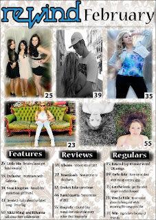
Within the creation of my content page I have used a conventional appearance, as I inserted five main images which represent the areas of interest with organised text at bottom of the page. For audiences comfort I have number my images in order for them to find what they are looking for quicker. I used a house style throughout the magazine by softening the edges of the features within my music magazine, this makes the magazine appear eye catching and helps it standout from other music magazines.
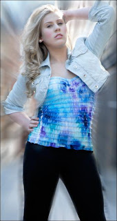
My article begins with a full-size image of Gabriela that takes up the entire page. I have done this in order to establish the artist which the article is regarding. On top of the image I included a quote to grab the audiences’ attention and appeal to them so that they would like to read the entire article. Then the next page to my image is placed my article in a conventional layout similar from the Vibe music magazine that I had analysed previously and which also inspired me. The article includes the interview I did on my artist and an image of her. My third page also contains an entire image of my artist; although this time I decided to include part of my article over my image. I have numbered and maintained the same colour scheme throughout the three pages of my article.


