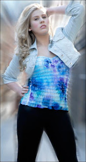
I wanted images that really stood out within my magazine, therefore I decided to use some different types of editing.
With my first image I had the idea of having the same image side by side but with different effects giving the magazine a creative appearance.
My starting image was a normal mid-shot coloured image.
Firstly I uploaded my image on to Photoshop and copied it, I then rotated it 180 degrees and applied the Black and White effect onto the image. To finish off I then pasted the original image and placed both images side by side.
------------------------------------------------------------------------------
With my second image, I uploaded it on to Photoshop, then applied the Black and White effect tool onto image.
Before:
After:
With My third and fourth image, I uploaded them separately on to Photoshop and decided to use the Blur tool so that i was able to get rid of the unwanted backgrounds as one of my images contained a bin within the background that made the image appear unattractive, and the other contained a Christmas tree which didn't really have much to do with the genre of my magazine, so I got to the conclusion that if I blurred the background I would be able to make the most of my images and at the same time give them both a creative appearance.
Third image - Before:
After:
Fourth image - Before:
After:


No comments:
Post a Comment